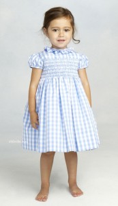
Who doesn’t love the fresh innocence of gingham? Well, If you love gingham like I love gingham, you’re in luck. It happens to be the fabric of the moment.
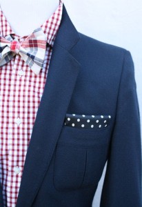

A little bit of gingham goes a long way. But too much can be a tad overpowering.
If you are familiar with the Color 1 Color System, you know that certain sized prints and patterns work better for certain color types.
For example, a Contrast Color Type would look simply stunning in this bold, red and white print. (This is technically a buffalo check.)
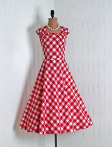
But, because of its size, this large pattern would completely overpower a Gentle Color Type. Gentles need less contrast and softer colors like this baby-pink gingham.
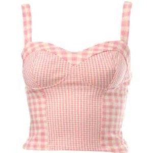
Light-Bright Color Types can handle a little more contrast, but still need a smaller, less overpowering print, like this navy and white top.

And Muted Color Types will look better in a gingham where the lighter color is not pure white.

Your full-length mirror will tell you if the gingham you’ve chosen is the right one. Stand about five feet away from the mirror. Close your eyes, then open. What’s the first thing you see–your face or the gingham? You should see your face, ideally enhanced by the gingham.
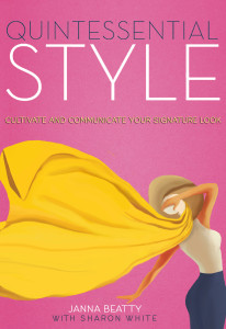
If you need help determining the most flattering patterns and prints for your color type, refer to pages 22-26 in Quintessential Style.

4 Comments
have never thought gingham was my fabric. I may look for something in a navy and white small print.
Lori, Yes, try to rethink gingham based on the color and size of the check. Maybe you just haven’t found the right one yet.
I have always loved gingham and I am very excited it is back. It seems as if we are getting back to a natural and comfortable look. Thanks Sharon and Janna.
I agree, Beverly. Gingham always looks fresh, especially for summer. Janna says it’s the size and color of gingham that can either enhance or distract from our natural coloring. She also has guidelines for which animal prints are best for each color type. Something many of us (including me) never really thinking about.