Who could forget this snarky quote from The Devil Wears Prada’s sinister editor, Miranda Priestly?
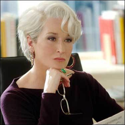
Well, ladies, get ready for a plethora of groundbreaking florals this spring. Everywhere you look, flowy, flowery, colorful prints are popping up.
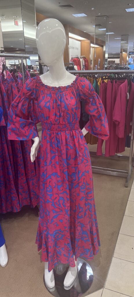
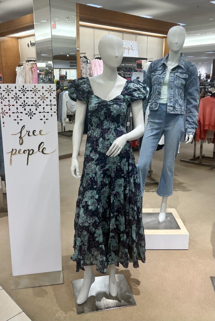
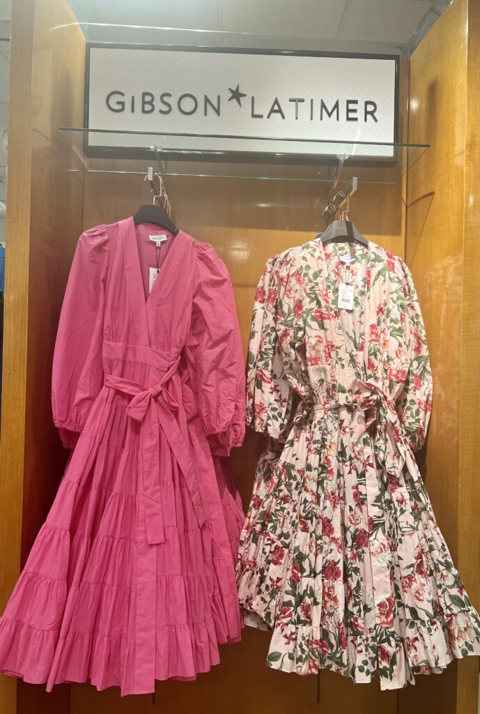
These styles are from Dillard’s. Full sleeves and ruffles add a fresh, romantic look. Perfect for Easter, a spring party, or a wedding.
And PINK still seems to be a popular color choice.
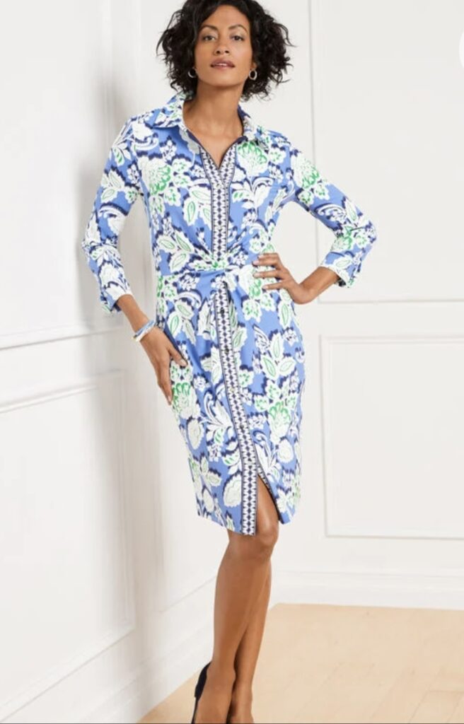
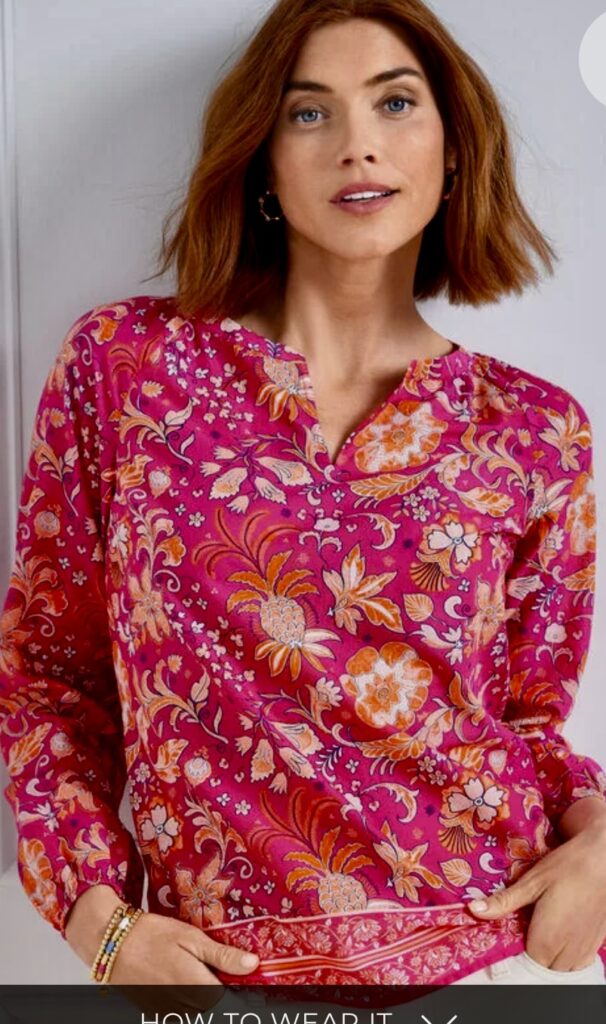
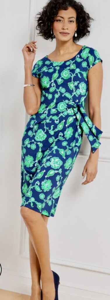
These vibrant prints are from Talbot’s.
But, do remember your individual color type when choosing floral patterns that are the most flattering for you. Let’s review from Q Style:
Gentle Color Types:
- Best prints are small/medium scale
- The larger the print, the more blended-looking it should be
- Plaids, stripes, check, and dots should look blended with medium contrast
- Can wear florals and watercolor prints
- Small amounts of pure white (refer to page 23 for prints to avoid)
Muted Color Types:
- Small/medium scale prints
- Gals over 5’6″ can wear very blended looking large patterns
- Florals, stripes, checks, and plaids should be blended looking with medium contrast
- Dots are okay as long as they do not have strong contrast
- Leafy patterns and triangular shapes (refer to page 24 for prints to avoid)
Contrast Color Types:
- Medium to bold scale prints
- Florals, stripes, dots, checks, and plaids should have strong contrast and definite design
- Dramatic, high impact combinations
- Black and white is a signature combo
- Shiny fabrics are great (refer to page 25 for prints to avoid)
Light-Bright Color Type
- Small/medium scale prints are best
- Florals, plaids, stripes, dots, and checks are better if they have small pattern and high contrast
- Fabrics should have light background and look very lightweight (refer to page 26 for prints to avoid)
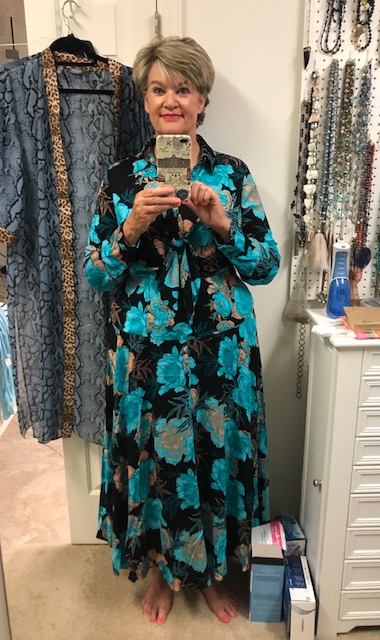
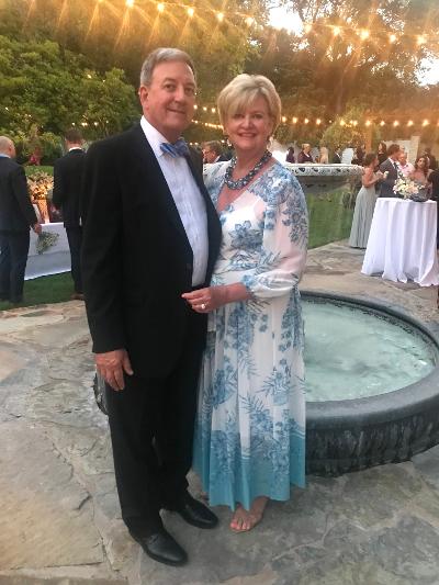
As you can see, color and contrast make a huge difference in how complementary a floral choice can be. Notice how dark and heavy the dress on the left looks versus the light, airy floral on the right–which is perfect for my gentle, light-bright color type.
So choose your florals wisely keeping print size, contrast level, and color in mind.

We think Miranda would agree.
“That’s all.”
Click here to order your copy of QUINTESSENTIAL STYLE.

Leave a reply