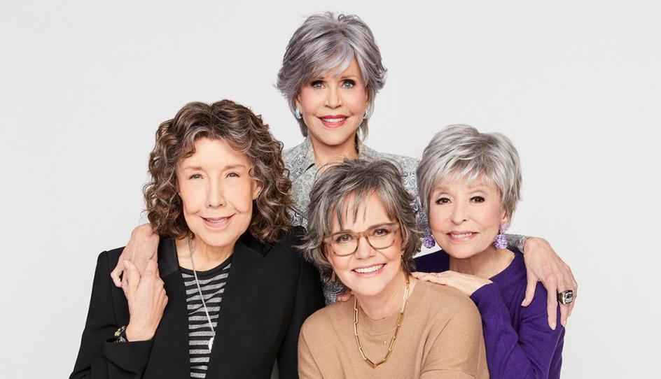
Glance at this picture of these four iconic women. Which one stands out first to you? I ask this to point out a concept from our book–which is: “The eye always seeks COLOR and LIGHT.
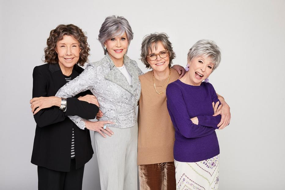
The first time I saw this photo in the latest issue of AARP, my eye was immediately drawn to Rita Moreno wearing stunning purple. Everyone else in the shot appears in neutrals. (And as we all know, neutrals are not a part of the color club--as noted in my blog from 2016.) Although, neutrals can be a very good backdrop for color.
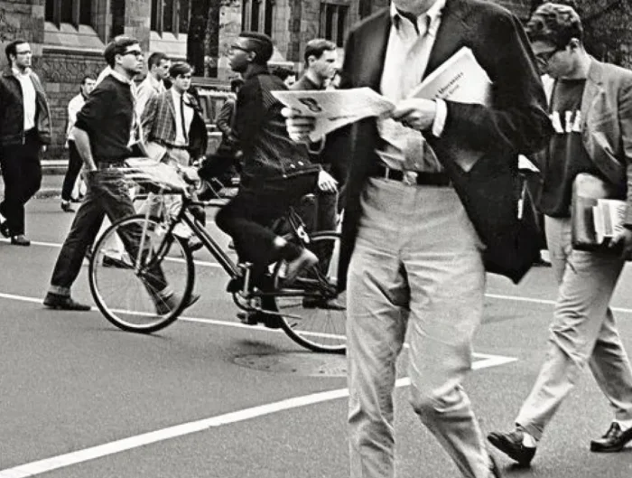
To further prove my point, look at these pictures:


In a backdrop of neutrals–black, white, and gray–the first thing your eye is drawn to is the color red.
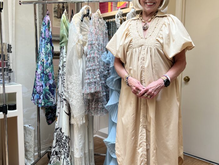
In the same way, your eye is also drawn to LIGHT. As shown in this picture.

Here is an excerpt from page 106 of Quintessential Style:
“When you look at someone, whether you realize it or not, you are immediately drawn to the light and color in their face. Someone may have absolutely flawless skin and be wearing no color on her face, but the woman sitting next to her who doesn’t have flawless skin–but has on a complementary shade of lipstick–will be noticed first. Why? Because our eye is immediately drawn to her color.
Janna Beatty

Please do not interpret this to mean that wearing neutrals is boring. (Jane’s gray top does have a lot of texture to add interest, and it also matches her hair color.)
On the flip side, wearing too much color at once can certainly overpower you. Maybe the stylist didn’t want all four gals wearing color???
I am not here to judge. I’m here to enlighten.
So, What’s your opinion? Have you ever thought about color and light in this way?
Please let us know what you think. And which of these “80 for Brady” stars stands out to you!
These women are ageless. I just hope when I get there, I can match their spunk, their energy, and their joie de vivre!



6 Comments
I immediately saw Rita first, her purple top popped! Then I noticed Jane because of the perceived sparkly jacket and her pink lipstick. Sadly the remaining beautiful ladies looked washed out and bland in comparison. This is an excellent color study and lesson for us later in life gals, I recently turned 69, gasp! I make sure I wear lipstick when I leave the house, and wear something polished yet pretty with a flattering color. Thanks Sharon, I always look forward to your enlightening posts!
Sounds like you have it all together, Sharon!
You have realized that change happens as we mature and you have adapted to the change. Sometimes we don’t understand there is a bit of a fall-off point as we age, and we need to add a bit of color to refresh our youthful color.
Thanks for your comments!
The first lady I noticed was Jane Fonda in her all silver gray clothing and hair color but her red lipstick made her stand out compared to Rita in purple with brownish lipstick and the other ladies with minimal face and clothing color. For me if I take a picture with no lipstick I look washed out no matter what color I have on but definitely washed out with a neutral on. That’s why I love color one so much! It’s been a game changer. I enjoy your articles too!
Yvonne,
Thank you, thank you, for confirming one of the main concepts from our book. COLOR is everything–especially as we mature. Sounds like you really understand its importance.
Thanks for sharing.
Jane caught my eye first as well with her light sparkly top and bright lipstick. I noticed Rita next with her purple top, then Lily, and Sally was last with her neutral outfit. This post was a great illustration of one of the many things we have learned from Quintessential Style!
Sherry,
It is quite amazing to discover that everyone seems to see things differently. I have heard from a few others who spotted Jane first as well (see Yvonne above). As I was writing the blog, I casually asked my Aunt Donna who caught her eye first–her answer was also Jane! Go figure.
Thanks for writing!!