Have you ever put on a blouse with a very bold print and thought, “This print is fabulous!” Or is your response just the opposite; “Yikes, I look awful in this.” A better question may be: WHY or WHY DOESN’T that print work for you?
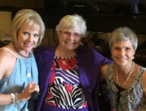
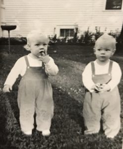
Fraternal twins, Diane (left) and Linda (right). With their lovely mom (center).
The answer is: IT HAS TO DO WITH YOUR PERSONAL COLORING.
This week’s blog tackles the issue of prints and patterns in clothing, and emphasizes personal coloring and the role it plays in determining which patterns/prints work best for each individual.
When twins are born, it is generally assumed that they will have similar features, height, and coloring. But what about fraternal twins? Here is “A Tale of Two Sisters….with very different coloring.”
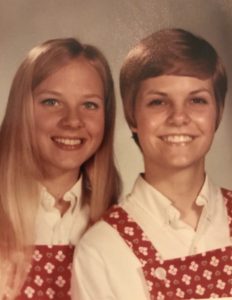
Diane (left) has her dad’s coloring. Linda (right) has her mom’s.
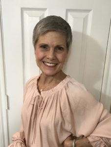
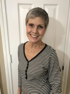
It may be hard to see in photos, but Diane has fair hair, fair skin, and blue eyes. Diane is a Gentle Color Type. Her sister, Linda, has brown eyes, medium skin tone, and once had dark hair, but is silver now. Linda is a Contrast Color Type.
“We have been taught that if you are petite, you should wear small prints, and if you are larger/taller, your best choices are bigger/bolder prints. Not necessarily. Your COLOR TYPE is a better gauge, as to what size pattern you should be wearing, than your stature.” …Quintessential Style (page 21)
Okay, we are going to the visuals now to prove that the statement above is truly conclusive.
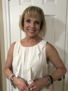
Pastels complement Gentle Diane.
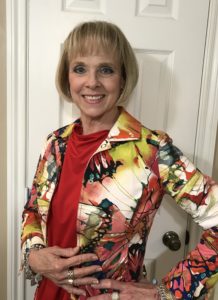
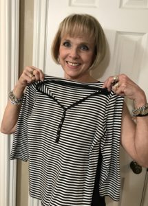
Saturated color overwhelms Diane.
It may be hard to tell, but Gentle Diane’s face is complemented by soft shades and pastels. Conversely, Diane is completely overwhelmed by too much bold print and saturated color in the photo at right. (You see the outfit before you notice Diane.)
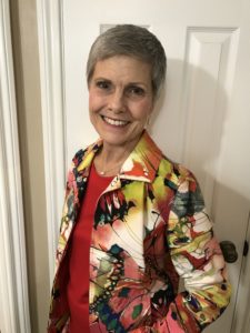
In just the opposite way, pastels completely wash out Contrast Linda (left), while she stuns in the bolder more saturated color and big print. (Notice how the pastels do not compliment Linda’s eyes and skin. But in the photo at right, wearing bolder color, her eyes light up and skin appears brighter.)
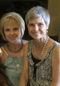
Contrast Linda
Gentle Diane
Look at these photos. Contrast Linda can wear black and white with ease. But put black and white on Gentle Diane, and she totally disappears. (Sorry, Diane.)
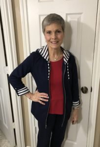
Contrast Linda can wear plaids, patterns, and prints with strong, distinct contrast. Black and white and bold colors are best. Red is an especially good color for Linda.
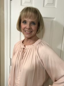
Gentle Diane looks best in off-white (never pure white). Her best prints are small/medium scale with very little contrast. This tiny-dot print looks fab on her, but would not be a good choice for her sister.
So, Gentle Diane looks best in: small prints with very little contrast and should avoid large prints and high contrast.
While Contrast Linda looks best in: large prints and high contrast patterns, and should avoid tiny prints and low contrast.
The most interesting thing about these two lovely sisters is that Gentle Diane is 5’7″ tall, while her petite sister, Contrast Linda, is only 5’4″.
Who can wear the BIGGEST, BOLDEST prints? Petite Linda.
And TALLER Diane looks best in small/medium prints.
What Color Type are you? Gentle, Contrast, Muted, or Light-Bright
Do you know which patterns/prints are your most flattering?
To find out more about your specific Color Type, read Chapter 3 in QUINTESSENTIAL STYLE: Cultivate and Communicate Your Signature Look. You can also refer to our Color Type Information.
Or contact my co-author, Janna Beatty @ Makeovers4u.com, for a complete color consultation.
One final note: Diane says, “Mother was a marvelous seamstress. Linda and I always wore matching outfits all through high school. But, looking back now, maybe we shouldn’t have!”
Okay, let’s just say it… Awwwww!
Special Thanks to Diane and Linda for their contribution to this blog!
You might also like
5 Comments
What a fun and informative post! I am a fashion junkie but never considered the type of prints I love to wear. I’m a contrast Linda and am relieved to report that my closet is filled with strong graphic black and white prints. It reminds me of the rule about wallpaper. That small bathrooms can pull off a big wallpaper print quite easily.
Mithra,
You so ‘get it.’ I am considered a Light-Bright color type, so I cannot wear black and white prints–just too much contrast for me. I do better with small prints or watercolors that blend together.Even though I am 5’10” tall, I really can’t wear large prints at all.
Thank you so much for writing.
Sharon
Brown lipsticks are a great under coat/base to tone down any ultra bright red, orange or hot pink lipstick.
Thank you, Adele.
I know our readers will appreciate this tip. I never thought of using it under an ultra-bright lipstick to tone it down! Thanks for writing.
So true, Adele.
Thanks for that tip.
For muted color types this is a great idea.